
For almost fifteen years I’ve been designing under the name of Copper Case. My graphic design boutique works with non-profit organizations and aspiring entrepreneurs to create materials that connect them to their people. I love telling visual stories and I love learning about all the varied and great things my clients do.
Why Copper Case?
The name of my studio is a nod to different aspects of me and my work. I love the natural transformation of copper, especially as it oxidizes with time and changes from a beautiful copper brown to a vibrant turquoise color. The word 'case' is a nod to two ideas: first, it honors my love of typography and the history of printing. In the days of movable type, metal or wood characters were kept in separate cases (upper & lower) to make typesetting easier. In that sense, this is my own 'case', where I document my work, where I can reflect on its evolution, and where I can share it with others. More importantly, ‘case’ references my fundamental belief that we all exist beyond our bodies—beyond our own unique cases. Mine happens to be copper.
Some of my favorite projects:


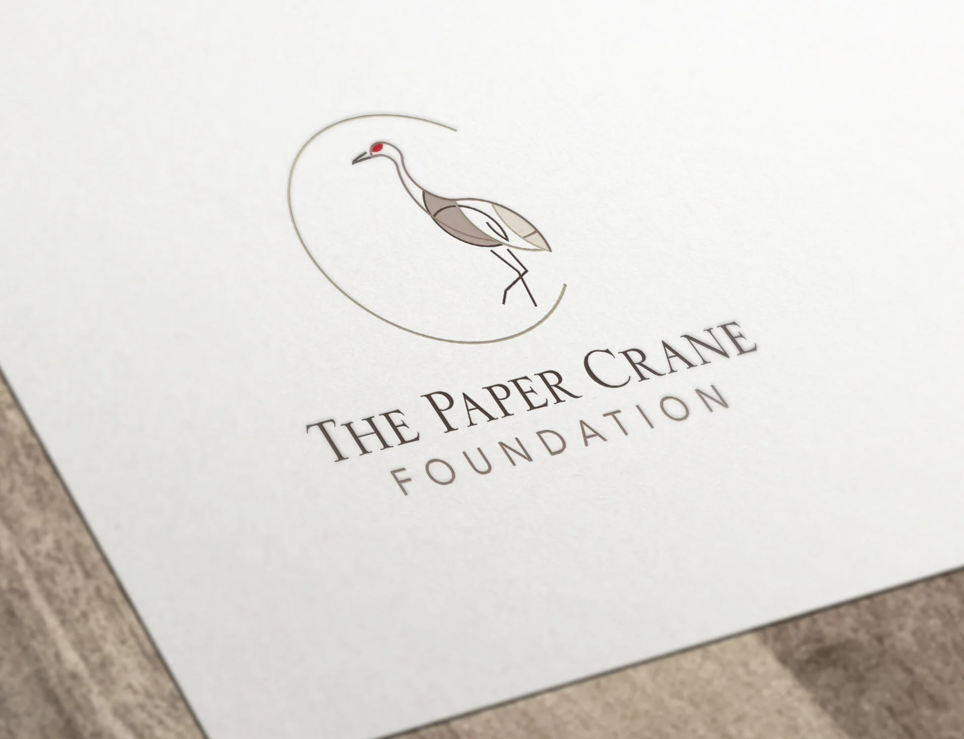
Geometrically constructed and graphic representation of a sandhill crane.

Letterforms ‘A’ and ‘S’ configured as an abstract canoe tip on water referencing the history of the name 'Senegal'.

Identity for a local birthing center, this simple icon depicting both a capital ‘B’ and a pregnant woman's side profile.

Custom-made knitted goods from Mexico whose identity showcases a yarn wrapped around a needle in the form of a calla lily.

Iconic representation combining the ideas of snowy mountain peaks and a lighting bolt atop an abstract letter 'W'.

Simple and elegant graphic representation of a tulip for family-owned upscale lifestyle boutique.

Confident mark combing the letters 'w' and 'b' eluding to the company's ability to reach out, heal and connect.

Simple representation of the letter 'H' made up of two rod iron bars and a wave for ocean-front real estate company.
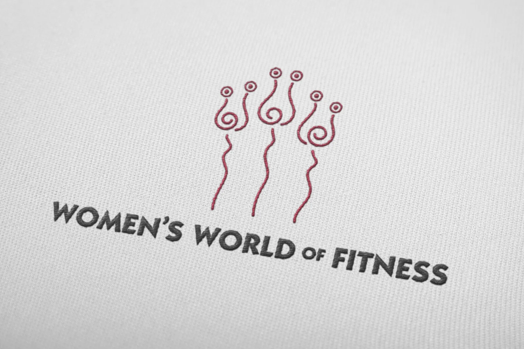
Simple and graphic lines representing both the elegant and beautiful shape of flowers and women figures lifting weights.

Distilled to its most fundamental shapes, the letter 'P' is constructed in such a way that it also shows a human joint.

Highlighting the craftsmanship involved with brewing the perfect beer this mark was created for local microbrew.

Elegant and simple representation of a woman's figure, this mark was created for a natural cosmetics company.


